When it comes to retail signage, it had been proven time and time again that regular change-outs yield almost immediate spikes in sales. To put it plainly, the strategy of consistently changing out your signing works; however, the execution of this process must be done correctly. Catching the attention of your potential customers through retail signage is highly effective, yet it is also a delicate science that begins at conceptualization.
When creating retail signage, there are clear guidelines business owners should adhere to so that their signs are not only noticed but also understood. These steps are simple and should be followed so your retail business can enjoy sustained success for years to come.
Below are two suggestions to ensure your retail signage is properly produced:
COLORS
Consumers associate certain colors with particular things or products. For example, green is often associated with being “healthy”, which is why this color is applied to many organic products. Yellow is a color that is used for sales and promotions, but studies have also shown that it makes people hungry, which is why many fast-food chains incorporate it into their logo. There are many other direct correlations between color and their associations, so prior to designing your retail signage, consider the colors that are going to be employed. To see an example, look at the Juice signage we did for Ralphs Grocery in Los Angeles. This sign employs a vibrant green on top of a black background, making it very easily seen and read.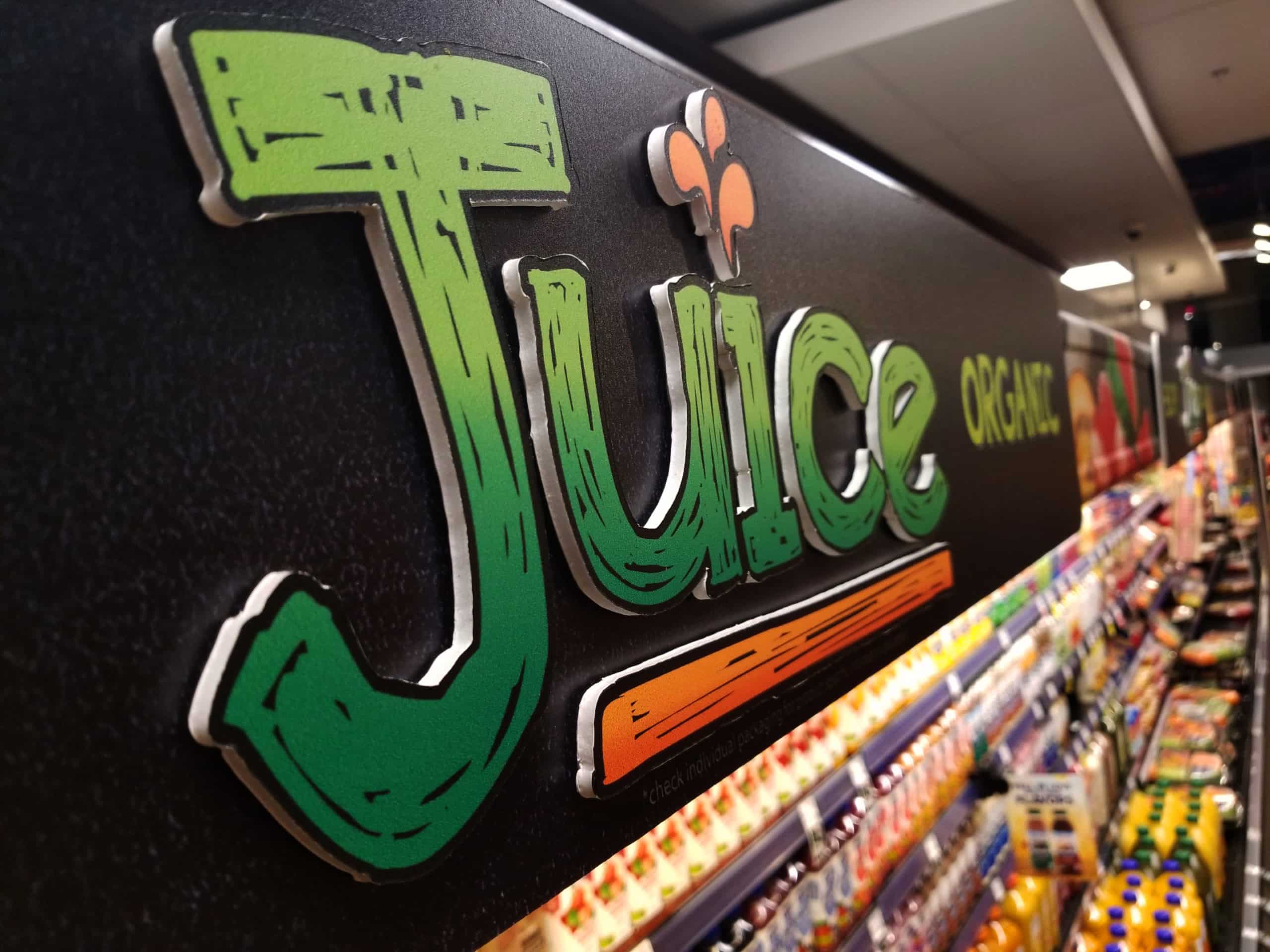
LEGIBILITY
No matter how attractive the sign, if the information on that sign is not legible, it will have the adverse effect. For many shopping can be stressful, especially if the store is crowded, so retailers should find every way to make the process more seamless. If consumers cannot clearly read your signage, this will only add to their stress. Two easy ways to avoid this pitfall is always consider what type of font is being used and the size of that font. Be careful when using script fonts and always consider the color of the writing and what the background on which it is placed. The combination of the two colors could make it difficult to read, or if the background is too busy, it could make the text hard to read. Our Fry’s Food and Drug “More Ways to Save” signage is a great example of a very simple and legible font that is still attractive to shoppers.
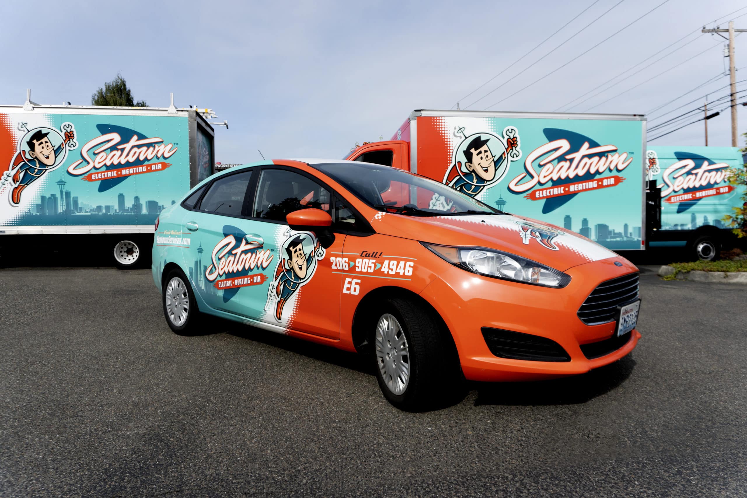
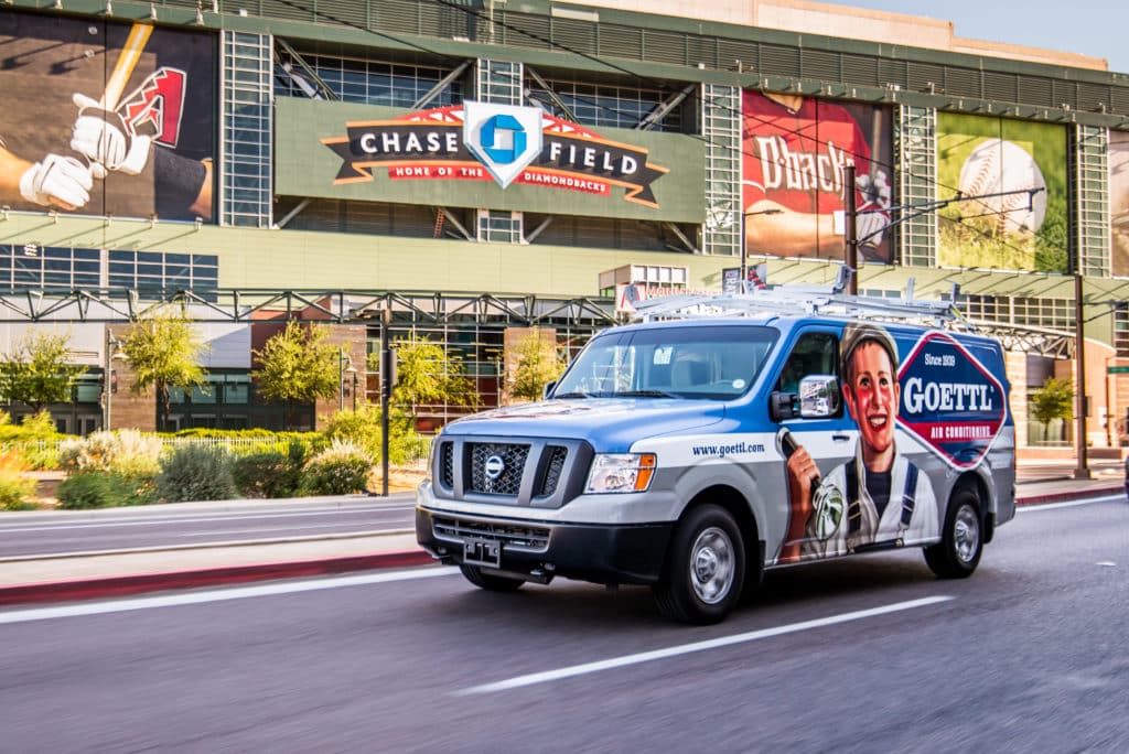
Our skilled team is completely focused on providing awesome service, especially when it comes to our specialties of retail signage/displays, corporate decor, and vehicle fleet wraps. Call us today at 866-907-8438 to learn more about our capabilities and how we can help you create and properly install your next project.