The Pantone Color Institute has announced their 2018 Color of the Year, and the design world is buzzing about it. Pantone 18-3838 Ultra Violet is this year’s color. Its bluish purple mix is said by Pantone to stir up thoughts of exploring the galaxy. Their Color of the Year page references artistic geniuses such as Prince, Jimi Hendrix, and David Bowie who have used similar shades of violet to express their individuality. It is said to provoke mindfulness and a sense of trying to find an elevated existence. Ultra Violet can also be used to help cultivate a sophisticated brand image and be viewed as a visionary. Be Bold When you’re preparing new large format signage for your business in 2018, consider incorporating Ultra Violet into the design. While this color isn’t as safe as some of the more commonly used options, it is eye-grabbing and carries an air of worldliness or even royalty. It can help your brand showcase its originality and stand out from the crowd. Fortune favors the bold, and so does marketing. Being brave and choosing a louder color can win attention and favor for a brand. [caption id="attachment_10157" align="alignright" width="632"]
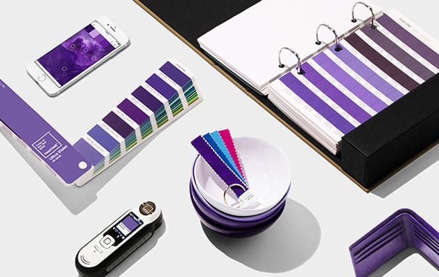
 Photo Credit: Pantone.com[/caption] Be Accessible Some in the past have viewed shades of purple as being effeminate, but this is no longer the case. Purple is a truly gender-neutral color, and this makes it ideal for brands looking for a mass appeal. Purple also looks great with the whole spectrum of skin tones. It’s great for clients who use models on their printed materials, or use large format printing as a background. This adaptability and inclusion of different skin tones and genders is a great look going forward into 2018. Be Beautiful Ultra Violet employs a well-balanced hue and has been selected in part because of its aesthetically pleasing tone. Ultra Violet pairs astonishingly well with a wide array of other colors, and is even surprisingly delightful when coupled with mint green. Pantone’s website even includes a variety of items that look great in this shade. Be Trendy Pantone is arguably the world’s leading authority when it comes to color. They communicate fluently with the eyes around them using carefully selected hues, brightness, and saturation. They mix each color carefully to make sure it is both beautiful and expressive. Pantone is the master of making sure the designed message is getting through clearly to the end customer. They carefully select their Color of the Year by considering the meaning and psychology behind colors. They conduct considerable research into trends to determine exactly which color will carry the perfect meaning to resonate with viewers in the coming year. Their color of the year starts as an excited buzz in the design world, eventually trickling down into every facet of life. Celebrities wear it on the red carpet. Luxury brands incorporate it into their designs. You can even find it on home goods and children’s clothing. Don’t be left behind when Ultra Violet makes its rounds. Ultra Violet in Large Format Printing Whether or not you’re ready to embrace the newest color trends, there should be considerable thought behind the graphics that represent your company. Your office, storefront, and even your company vehicles all reflect back onto your brand, so it’s best to make them say something great about you. We at azpro are ready to assist both clients who are ready to incorporate Ultra Violet to their image and clients who want a more classically conservative look. We have the talented team and top of the line resources required to offer a vast range of services. If you’re not sure what you want yet we can create a completely new idea for you. We manage the entire printing, cutting, and fabrication process, and make sure the project stays on track the whole time from design to installation. Contact us today to get us started on your next project. We can’t wait to see how we can help take your brand image to the next level.]]>

retail sign company

What are Retail Displays?

In 2020, consumers made 82% of retail purchases in a physical store. Despite the continuing development of online shopping through sites like Amazon, companies continue to profit from investing in…

READ MORE
retail signage

What are Point of Purchase Displays?

POPs are an effective way to bring attention to your products and services throughout your store, whether you have a a new item or service, a seasonal sale, discounts, etc.…

READ MORE
vehicle fleet graphics

Vehicle Wrap vs. Painting

Vehicle wrap vs. painting, which is better? It’s important to consider costs, downtime, and quality when it comes to altering the appearance of your entire fleet of service vehicles. In…

READ MORE

The ROI of In-Store Signage

Think about your favorite local grocery store. Can you visualize the signage throughout the store? How about their unique color theme and even their logo? Memorability matters, especially when it…

READ MORE