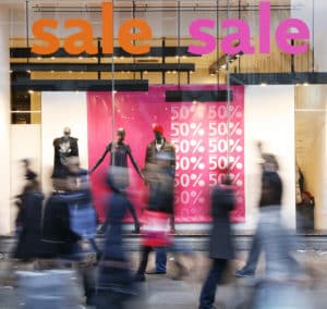
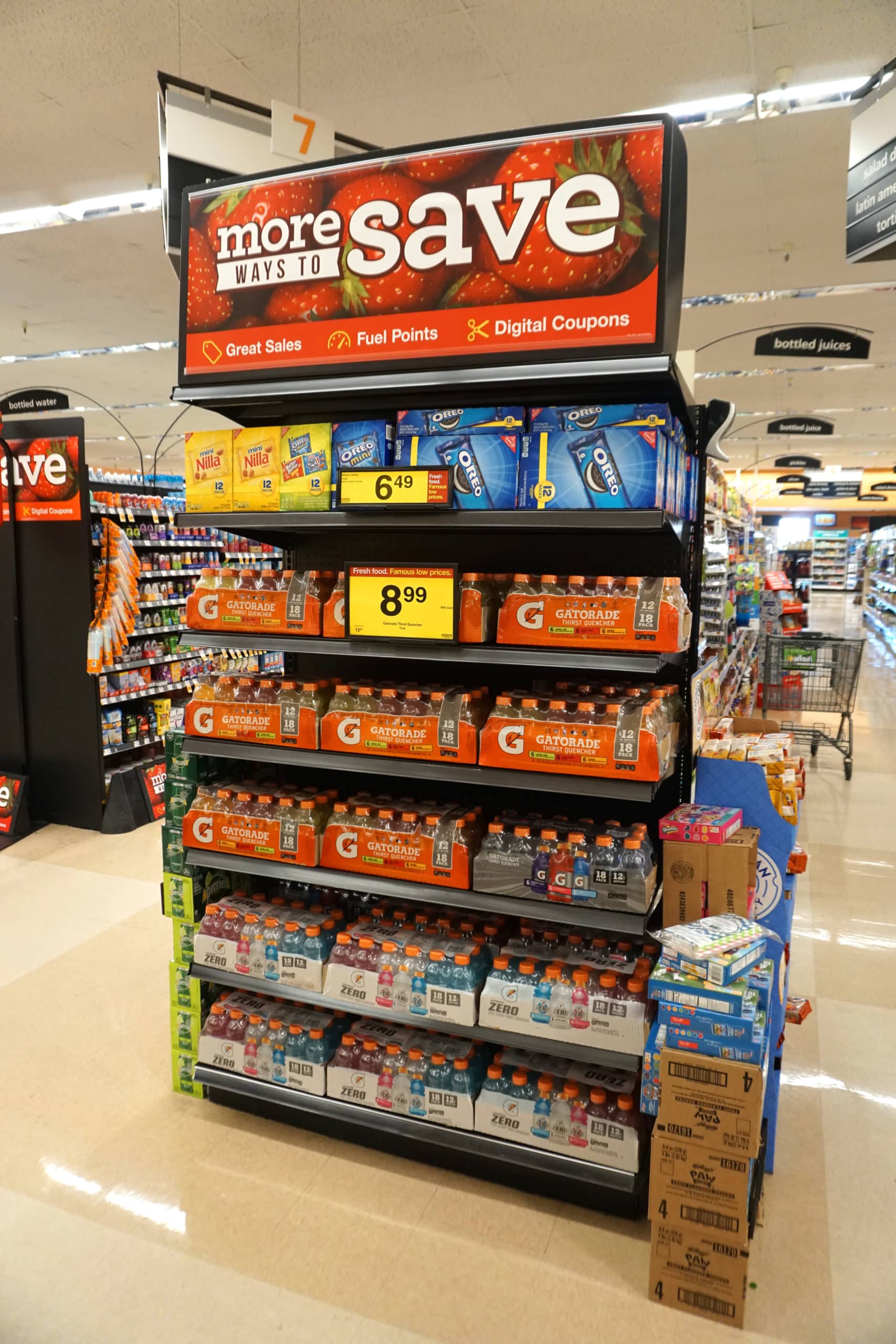
Pantone colors are standardized codes that we use when we refer to colors. In this article, I will be discussing the various types of Pantone colors and their applications. Hopefully, this will give you a more meaningful understanding of colors and will enable you to select the right Pantone colors for your retail signage campaign. Color plays a vital role in advertisements. It has a significant effect on your customer’s perceptions of your product. Red is the color that makes you stop in your tracks. Red is the color of fire and blood, and humans are wired to notice it. It is no coincidence that stop signs and stoplights are red. It does an excellent job of grabbing your attention. This eye-catching color is an excellent choice for retail signage. Red is associated with impulse and passion. The color green is often associated with nature. We see this color used in signage that is related to health, wellness, and the environment. White is the color of cleanliness, purity, and safety. It is usually associated with positivity. It often evokes a feeling of simplicity which can be helpful when advertising products that are deemed as complicated like technology. Orange is associated with athletics and energy. This color is popular when it comes to sports teams and energy drinks. It is a noticeable color which catches our attention similar to the color red. This is why orange is associated with construction. The color yellow is cheerful and fresh. It is associated with optimism. Yellow is also an excellent attention grabber, and that is why taxi cabs, school buses, and many road signs are yellow.  Blue is a color of trust. We see blue logos everywhere in every industry. Some examples of companies that use blue logos are Facebook, The Weather Channel, Microsoft, and more. The reason why it is so popular amongst so many companies is that it is associated with productivity. It also evokes feelings of calm and confidence. We often see it used to promote products or services related to air or the sea like airlines, water purification systems, or cruises. Please note that it is not a good idea to use this color in signage related to the food industry because it has been shown to suppress appetites. Black is a powerful color that is associated with elegance and mystery. Purple is a color that is rarely found in nature. Before synthetic dyes became available, it was an expensive color to create. It was for this reason that Kings and Queens wore purple robes and wrote using purple ink. Purple was considered a status symbol. In ancient Rome, certain emperors even forbid common- folk from wearing it. Today, people associate the color purple with the divine and exotic. Pantone colors subconsciously influence consumers when they are making purchasing decisions. By incorporating this knowledge into your signage, your retail signage will work more effectively and deliver results. Call azpro today at 866-907-8438 to learn more about how we can help you create more effective retail signage. ]]>


